Culture
Pantone and the business of owning a colour language


How an ink chemist at a New Jersey printing firm turned colour matching into a world standard, and how Pantone's Colour of the Year turned that standard into a stage for telling people what to like.
A printing firm and its chemist
Pantone began in the 1950s as M&J Levine Advertising, a commercial printing company in New Jersey owned by the Levine brothers.1 In 1956 they hired Lawrence Herbert, a recent Hofstra University graduate who had studied biology and chemistry and had been planning to go to medical school.12 He was taken on to match colours, and he used his chemistry to sort out the ink side of the business. One company history says he cut the printers' stock of about 60 pigments down to a basic palette of twelve, and later to ten base inks from which everything else could be mixed.2
By 1962 Herbert's ink and printing division was making money while the Levines' commercial display business had run up debts of around US$50,000. Herbert bought the company's technical assets from the brothers for US$50,000, which cleared the debt, and the business became Pantone.12 The same history says the money came from a backer who took no stake in the company and whose name has never been made public.2
A number for every colour
The problem Herbert set out to fix was an ordinary one. A designer would ask for a particular red, the printer would mix it by eye, and the result would change from job to job and from printer to printer. His answer was a printed book of swatches in which every colour had a number and a recipe made from the same small set of base inks, so that anyone holding those inks could mix the same colour. The first Pantone Matching System guide for printers came out in 1963.23

The clever part was what Pantone did not do. It did not set out to make the ink. Herbert wrote to 21 ink manufacturers offering them licences to produce the system's base inks, and according to the company history all but one signed up and paid a royalty within about two weeks.2 Pantone owned the numbers and the standard, and other people did the manufacturing. By the mid-1980s the Pantone name appeared on products sold in more than 50 countries.2 The library now runs to around 10,000 shades, and Herbert led the company for more than three decades.4 It was bought by X-Rite, a maker of colour measuring instruments, in 2007 for US$180 million. Danaher bought X-Rite in 2012, and in 2023 Pantone went with the part of Danaher that was spun off as Veralto.1
None of this is hard to defend. A company that wants its red to look the same on a cardboard box in one country and a T-shirt printed in another needs a shared reference, and Pantone supplied one.
The Colour of the Year
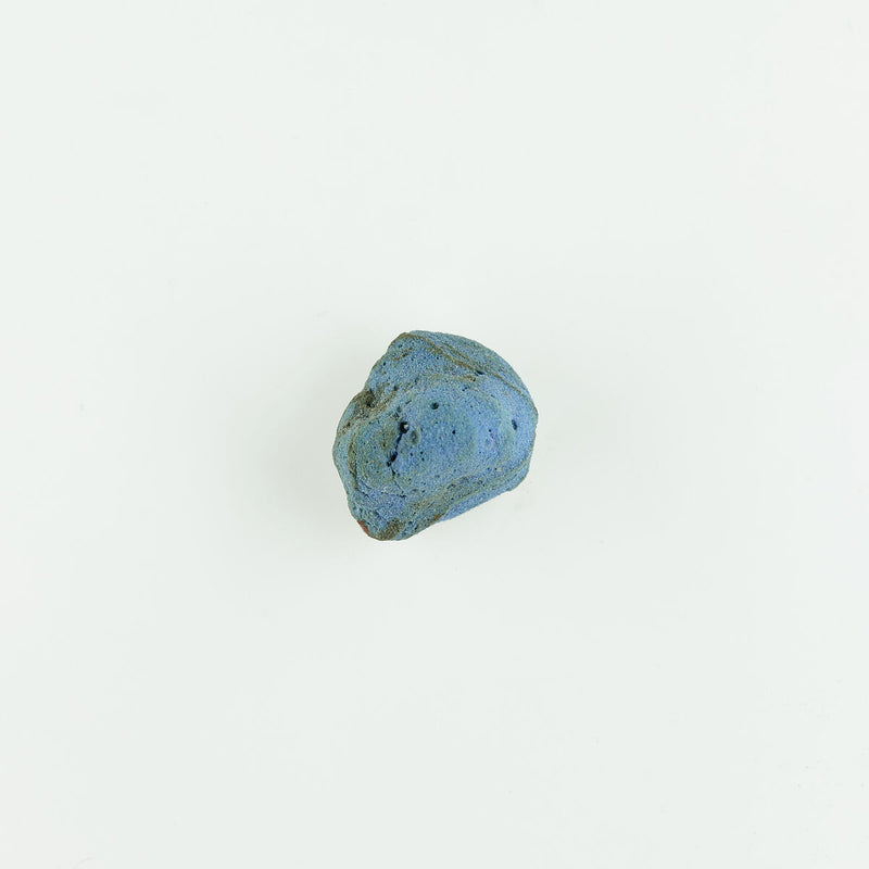
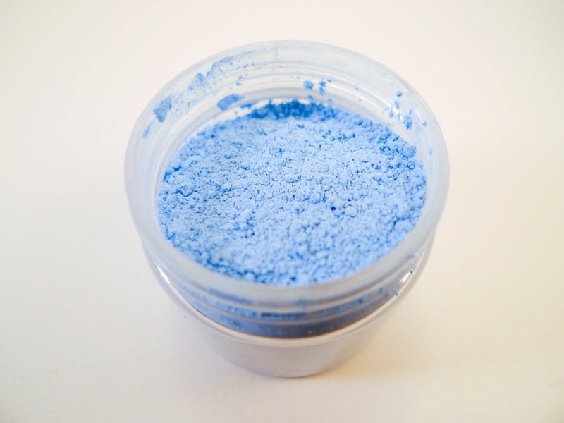
The more contested part of the business started in 2000, when Pantone named Cerulean its first Colour of the Year. It has picked one every year since.5 The choice is announced in December for the year ahead.6 The writer Tom Vanderbilt, reporting for Slate in 2012, described how it is reached: colour specialists linked to national colour standards groups meet twice a year in a European capital, in a room picked to be drab so it does not sway anyone, and spend two days presenting palettes built around a theme agreed in advance.7 Pantone itself has described the selection as "highly subjective".3

Some of the picks are remembered more for their names than their shades. Living Coral was the colour for 2019 and Classic Blue for 2020.5 For 2016 Pantone chose two colours for the first time, Rose Quartz and Serenity, a pale pink and a pale blue.8 It did so again for 2021, pairing a yellow called Illuminating with Ultimate Gray, which Pantone presented as a response to the year everyone had just had.6 The company has said the choice is meant to reflect what is already happening in the culture rather than to forecast it.4
Critics point out that the announcement helps make itself true. In the months before each reveal, Pantone reportedly signs licensing deals with companies ranging from nail polish makers to hotel chains, so that the colour is ready in shops when the news breaks. Anne Quito, writing for Quartz, called the forecast "in part, a self-fulfilling prophecy".3 When the colour then turns up everywhere, that looks like proof the pick was right.
Stuart Semple and Pantone
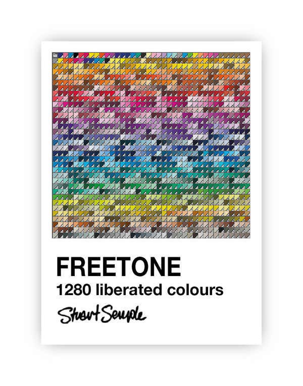
Stuart Semple has argued for years that colours should be open to everyone, and Pantone has given him plenty to argue with. In late 2022 many Pantone colour books stopped working inside Adobe's design software for anyone without a paid Pantone Connect subscription, and designers opening old files found colours missing. Stuart responded with FREETONE, a free plug-in containing 1,280 colours.9

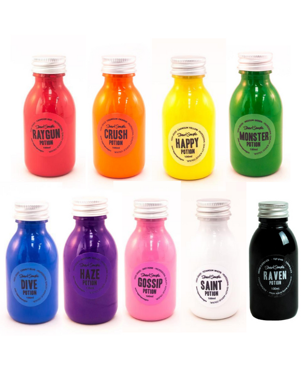
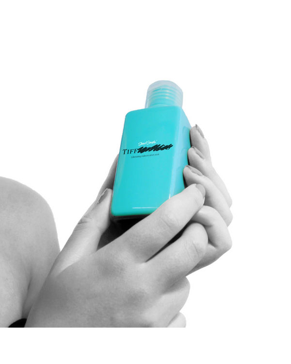
A few weeks later Pantone named Viva Magenta as its colour for 2023. Stuart answered with a pigment called VIVA MEH-GENTA and said the proceeds would go towards a "people's color of the year" chosen by artists. He told Print magazine that he wanted a colour picked in the open rather than "a fantasy cooked up by a brand".10
- Wikipedia, Pantone.
- Funding Universe, History of Pantone Inc., from the International Directory of Company Histories.
- The Fashion Law, Pantone: How One Company Built a Business Turning Color Into Cash, 2019.
- Choose New Jersey, How Pantone Set the Standard for Color Formulations, 2019.
- FashionUnited, Explore every Pantone Colour of the Year since 2000, 2020.
- Mental Floss, Pantone Announces Illuminating and Ultimate Gray as Colors of the Year, 2020.
- Tom Vanderbilt, Sneaking into Pantone HQ, Per Square Mile, 2012 (excerpt from his Slate article of April 2012).
- Dezeen, Pantone reveals first two-tone colour of the year with Rose Quartz and Serenity, 2015.
- The Dieline, Stuart Semple 'Liberates' Color Books Inside Adobe Software With 'Freetone' Plug-In, 2022.
- Charlotte Beach, Stuart Semple Releases a Color Diss Track Targeting Pantone's 2023 Color of the Year, PRINT Magazine, 2022.